Published in the German magazine NaturFoto, May 2003. The photos are the same ones as used in the article.
These photographs are also available large (about 850x850). Click on the image to enlarge.

Historically many landscape photographers have used large format cameras. The large negatives or slides deliver beautifully detailed images with a very nice tonality. Most of the time the subject doesn't move, so the slow way of working is no problem. An added bonus is the possibility of using tilt, rise, shift and the like - those movements enable exact placing of focus and perspective.
These cameras have disadvantages as well: heavy carrying is involved, the materials used are rather expensive and slides can hardly be projected.
On the other end of camera spectrum there is the 35mm camera (film or digital) with its many lenses, its low weight and relatively low costs. One clear disadvantage they have: the small film area.
No surprise many photographers choose the golden mean: the medium format!
Landscape seems to fit best in the panorama format. Most scenery stretches into a certain width. But most medium format cameras make images with a less rectangular ratio, like the 3:4 of 6x4.5 or 4:5 of the 6x7 format (actually 55x70mm) or even all square: 6x6!
And frankly, yes: for panoramas a 6x17 camera is of course a magnificent tool to approach the landscape. But I myself chose the square.
I like to work within this format. On first sight it isn't the most intuitive for landscape, but it has several important advantages for me.
This format is very flexible for composition - but there is more. In this article I mention the most important points. By no means though am I claiming superiority for the square over other formats. But it certainly is different and has its own charms.
The square frame has no tension as such. It gives the subject lots of space and therefore breaths rest. It is up to the photographer to give the image tension and excitement by means of subject choice and composition. In other words: lots of space for the photographer as well!
To me a good (landscape) photograph, is a photo where my eyes are drawn all over the image and make some sort of route. As a photographer one can use forms, colours or visually striking parts of the subject itself. Nice is of course when all these different image elements come together and support each other.
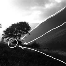
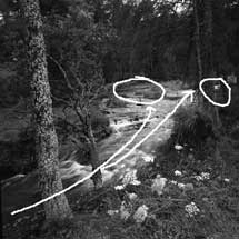
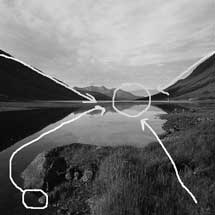
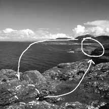
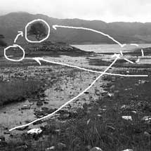 A good exercise for me to learn how to compose is this: I take a photograph that has some value for me, that doesn't leave my mind. On a piece of paper I make an outline of the most important parts of the photo. Then I take a
pencil and put a circle or circles about the point(s) my eye keeps returning to. Then I place some arrows to point out the route my eyes take from point to point.
This analysis of images is a good way as well to judge my own images critically. Have I framed well or are some parts meaningless? Are some elements disturbing because they draw to much attention? Is the photo a unity, or did I just draw all independent arrows?
During the process of making photographs I try to see what the most important points of the subject will be, in other words: where the circle(s) will be put. Then I frame around those points in such a way that all of the images will be filled with arrows - parts without interest should be left out.
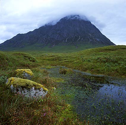
This making of a composition can take a very short time (because of midges I had to retreat from the field of Buchaille Etive Mor within 10 seconds), sometimes it has me puzzled and it takes a long time: a bit to the left, some sky or not, telephoto or standard, no - this way is best.
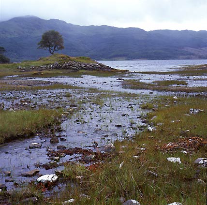
The square has some interesting possibilities. First of all, one never has to choose between horizontal or vertical position. Doing landscapes this means the width and space of a scene can be shown without leaving out the foreground. Something 35mm can not always do! And this way the eyes are drawn from the foreground into the landscape.
 |
 |
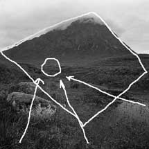 |
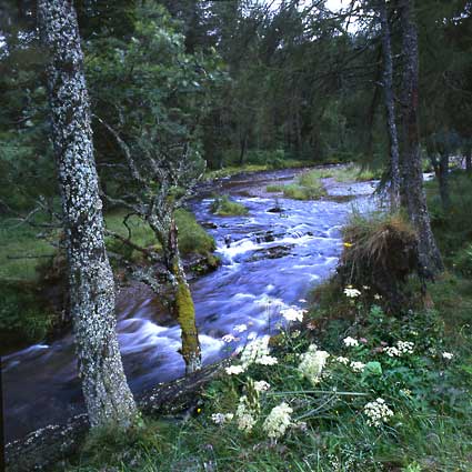
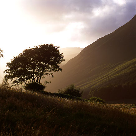
| Glen Rosa | Tyndrum | Buchaille Etive Mor |
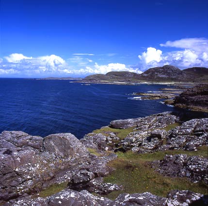
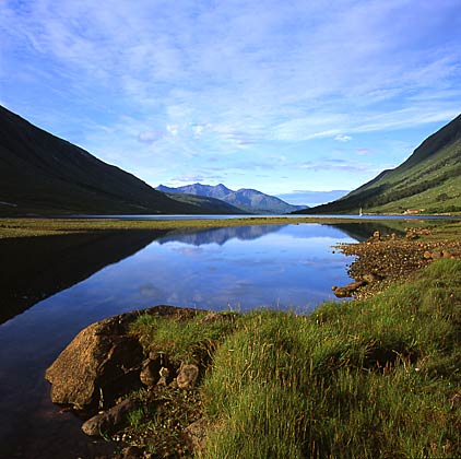
Within the square many routes for the eyes can be made: triangles (Glen Rosa), diagonals (Tyndrum); diamonds (Buchaille Etive Mor); Andrews crosses, where everything points to the
center (Loch Etive); ovals (Sanna Bay).
Of course all of this can be done with the rectangular format as well, but in my experience the square has more to offer here.
 |
 |
| Loch Etive | Sanna Bay |
For symmetry (Loch Etive) there is space enough, even if the axis of the reflection is not exactly in the middle. Within the square one can very well put that axis higher or lower, without hitting the head or bottom of the frame.
Most images we look at are rectangular - like television and computer screens. By the square one is forced to see the subject and the world of forms in another way. The first times I used my 6x6 camera it caused some desperation: how to fill the square?
But in the end this meant that I had to spend more time and attention to the making of my photographs. It forced me to look with a fresh vision while framing and to experiment with the placing of the camera.
Of course after a while the novelty of it is gone - tame to take a rangefinder, a pin hole camera, or whatever I never did.
A great help for composing is the waist level finder most 6x6 cameras have. Taking your ease you can look at the image - no peering and peeping through a tiny little finder - and examine the slide on the light table so to speak. Especially combined with a tripod, this is a great way of working.
And you will need a tripod soon anyway if you use medium format gear - especially so with landscape. It can be a bit of an enemy on a photo trip, but once returned home it is found to have been a great friend!
It is not only the making of a photograph that counts. Presentation is an important part of the work as well. After all: what is an image nobody wants to look at?
For projection the square is a very pleasant format. The entire screen is filled. The image is as it were without edges, without an imperative frame. And you never have to look at an awkward change of horizontal and vertical slides.
Most albums and books are upright rectangular. No good for broad panoramas. Square photos cause less problems and leave some space for captions - nevertheless at the same time filling the page nicely.
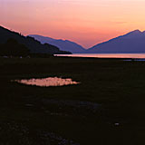
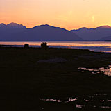
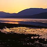
I like small series of 2 or 3 square images on the wall. Very special is the segmented panorama: a series of linked photos within one frame, with each its own cut out in the mat.
 |
 |
 |
For an editor of a magazine, books or ads, the square is nice as well. It leaves lots of space to put text in or to crop the image. Of course this doesn't apply to each image!
And it draws more attention than all those rectangular images. A square photo has more stopping power and can therefore be sold more often.
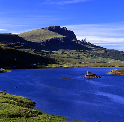
It isn't necessary to set aside lots of money just to experiment with the square. A TLR is a nice introduction and for many the camera of their lives.
And by means of a good cutter each rectangular print can be cropped to square. For those who project their slides: if you put both sides of the mount cross-wise, you get some sweet do-it-yourself square mounts!
This article has been written by Wim van Velzen, © 2003.
Comments on the article and photographs are welcome!
More thoughts about composition and the use of different lenses can be found in the article on focal length.
The landscape photographs shown here and lots more are put in several portfolios!
It is also possible to order landscape prints or to use them editorially or commercially.
Do you want to see more use of the square?
Take a look at the site of the British photographer Keith Laban.